Project Overview
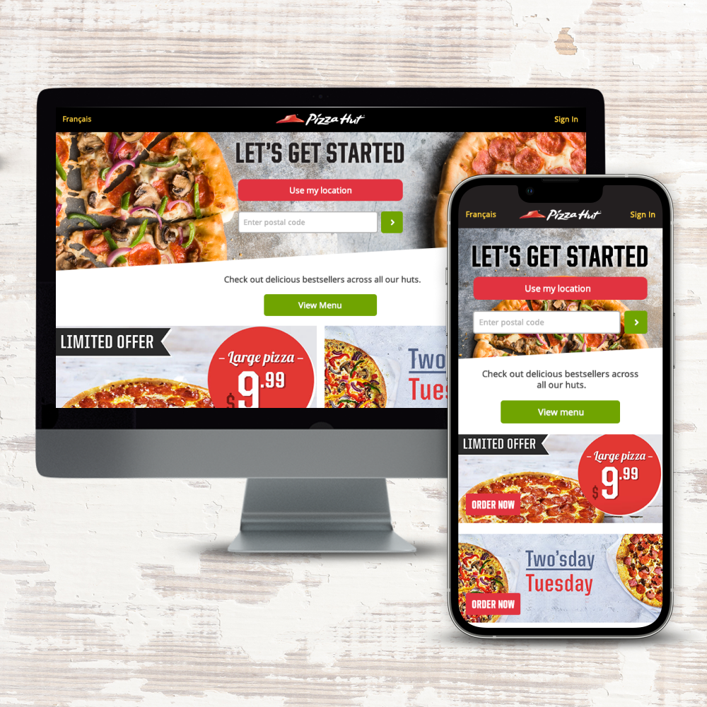
I was tasked with redesigning Pizza Hut’s online delivery website to create an intuitive and user-friendly platform. The main goal was to simplify the pizza customization process while making it easy for users to navigate the extensive menu without feeling overwhelmed. The challenge was to maintain a seamless experience across both desktop and mobile devices, given the diverse range of products offered by Pizza Hut.
Challenges & Solutions
1. Efficient Pizza Customization: One of the biggest challenges was developing a pizza customization process that was both efficient and straightforward, especially on mobile. My initial prototype, called the “Pizza Builder,” required users to go through about 10 steps to add a pizza to the cart, regardless of the complexity of their customization. I realized this lengthy process could lead to user frustration.
To address this, I designed a more streamlined prototype that reduced the process to just three steps. After conducting multiple rounds of user testing on both versions, we received positive feedback favoring the simplified process. As a result, we chose the 3-step approach as the final design, significantly improving the user experience.
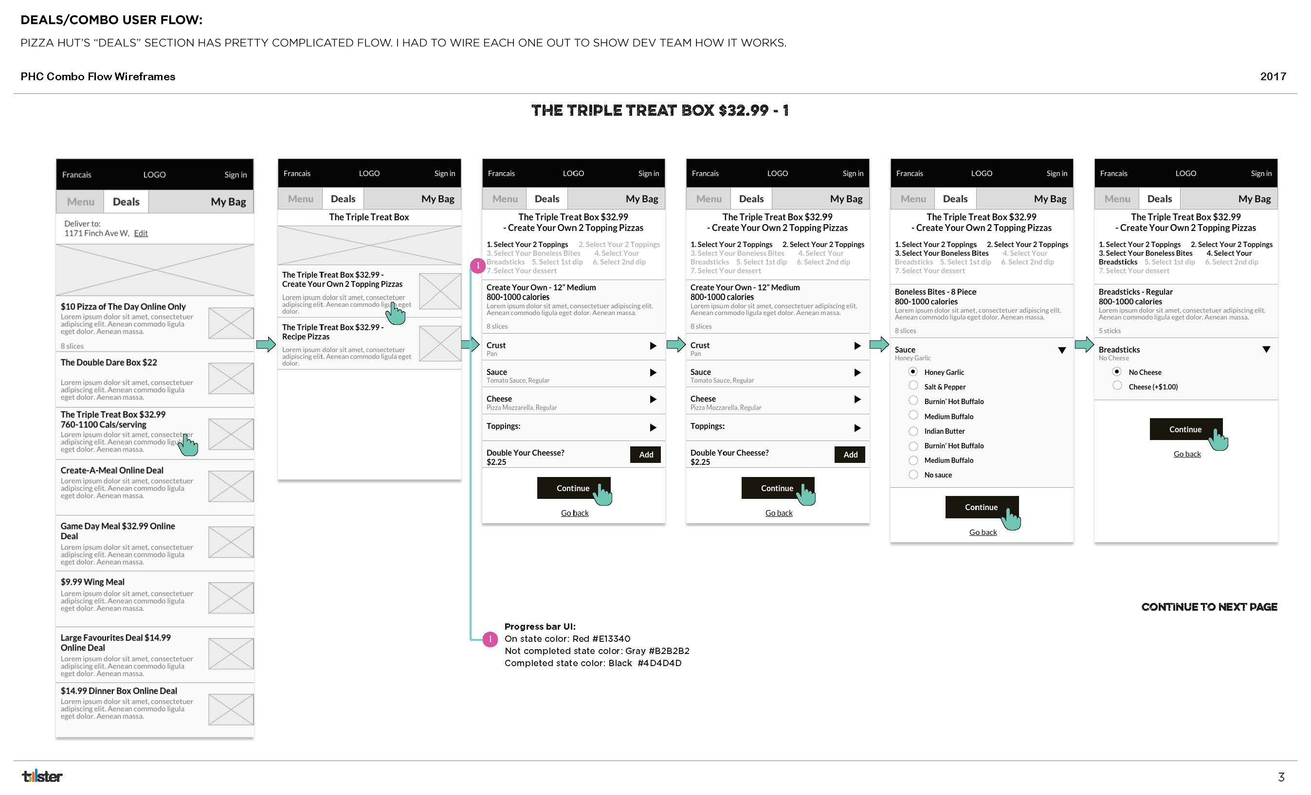
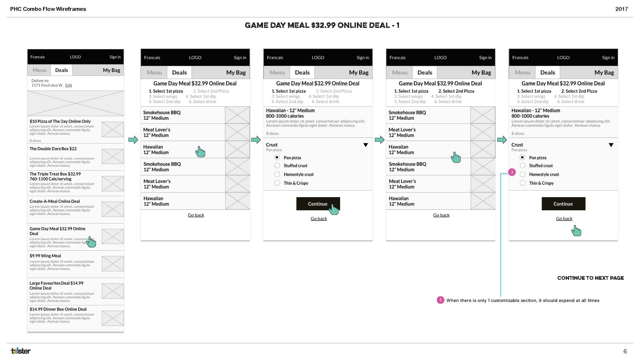
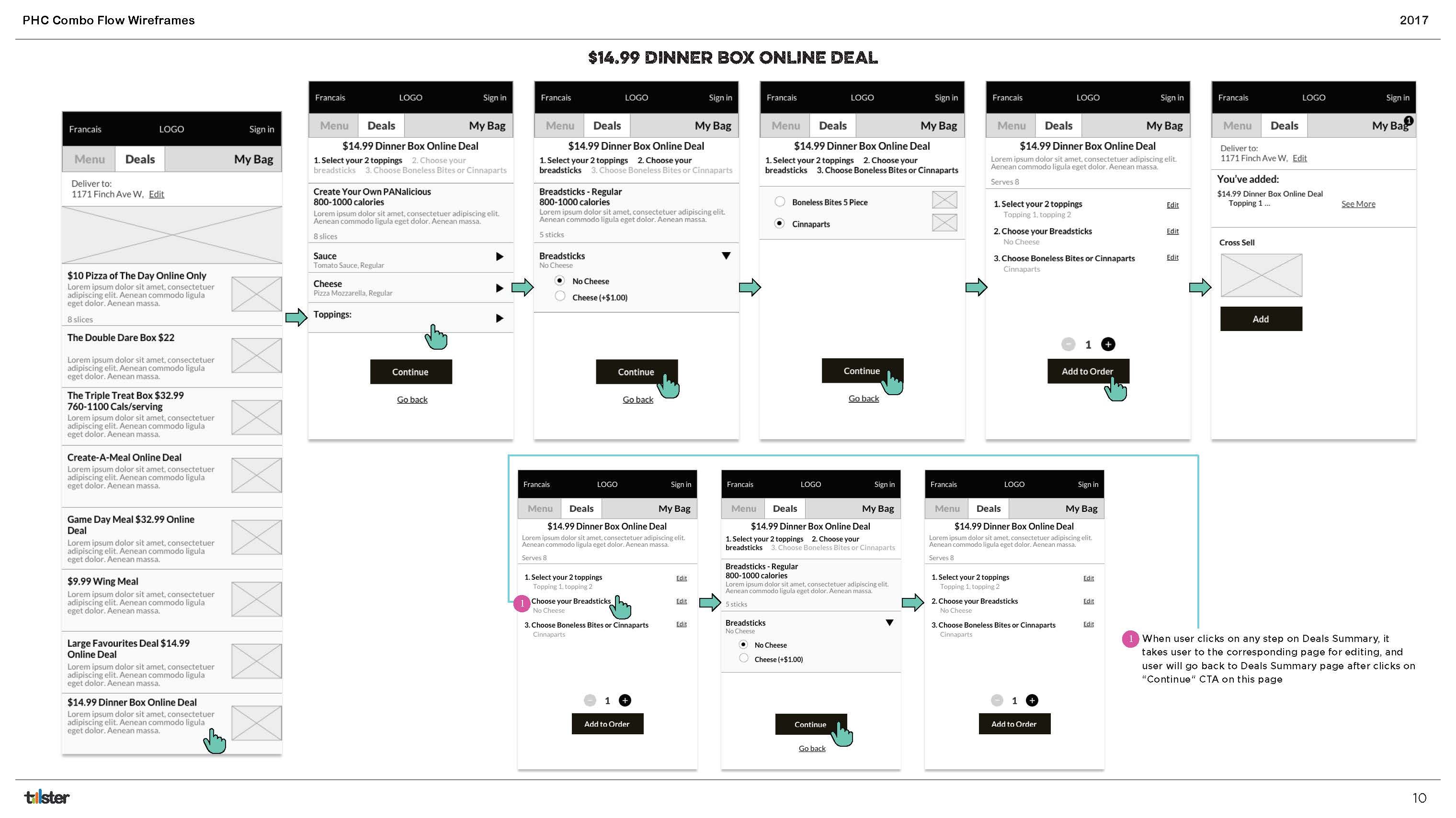
2. Navigating an Extensive Menu: Pizza Hut’s menu includes a wide range of items beyond pizza, such as wings, drinks, desserts, and a variety of deals. On mobile, it was essential to present these options clearly without overwhelming users.
To solve this, I categorized the menu into two primary tabs: ‘Menu’ and ‘Deals.’ The ‘Menu’ tab encompassed the core product offerings, while the ‘Deals’ tab focused specifically on promotions and discounts. This clear separation allowed users to easily browse the menu without confusion, especially on smaller screens.
Outcome
By iterating on prototypes and gathering user feedback, we successfully developed an intuitive and efficient online ordering experience for Pizza Hut. The redesigned website made pizza customization easier and improved menu navigation, especially on mobile devices. The final design aligns with Pizza Hut’s commitment to providing a seamless, enjoyable customer experience.
Reflection
Working on this project reinforced the importance of balancing functionality and simplicity. Through collaboration with product managers and developers, we created a responsive design that enhances the ordering process, and hugely improved customer satisfaction.
We have launched all releases on a tight deadline and continue to improve the UX for conversions.


