Burger King Responsive Site Mobile View
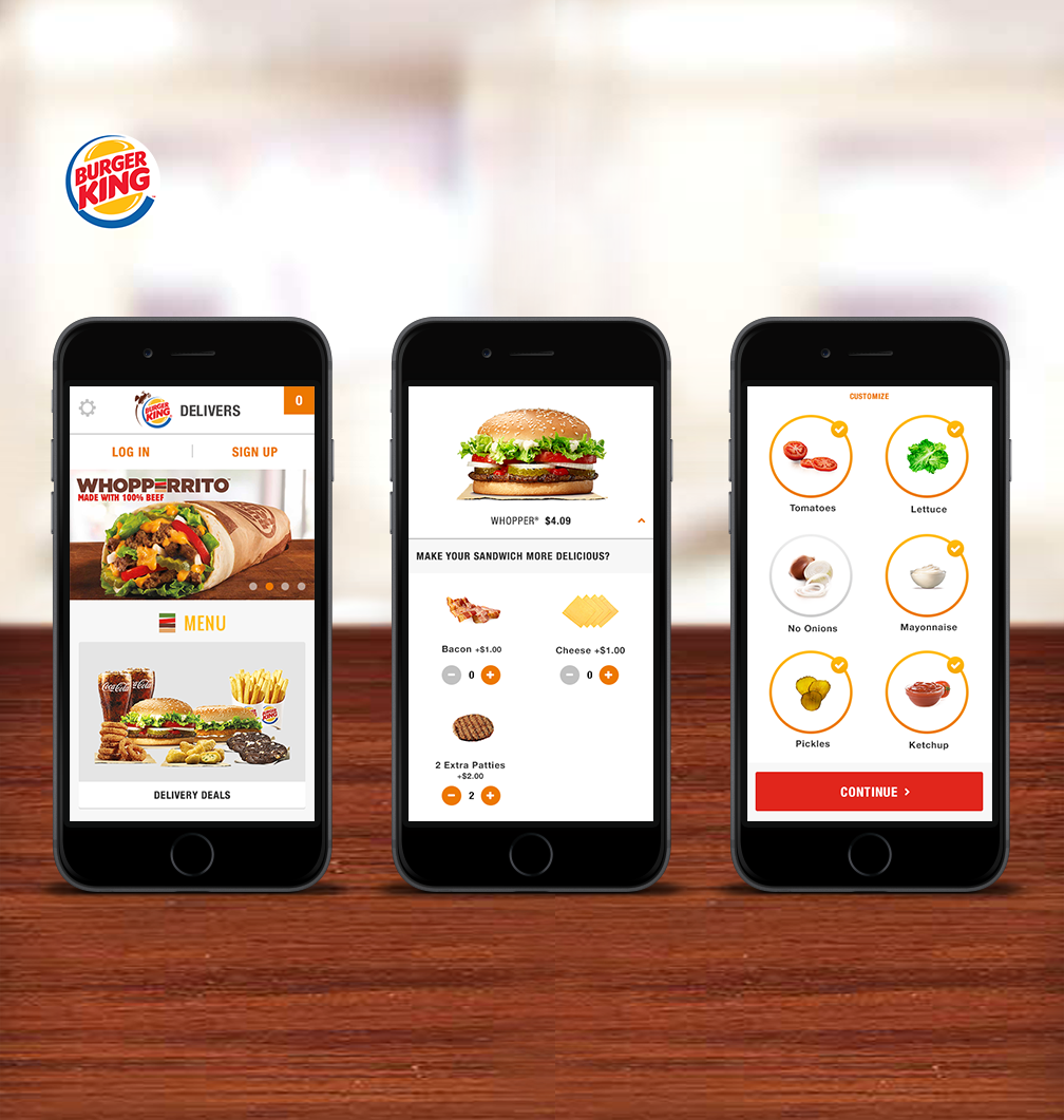
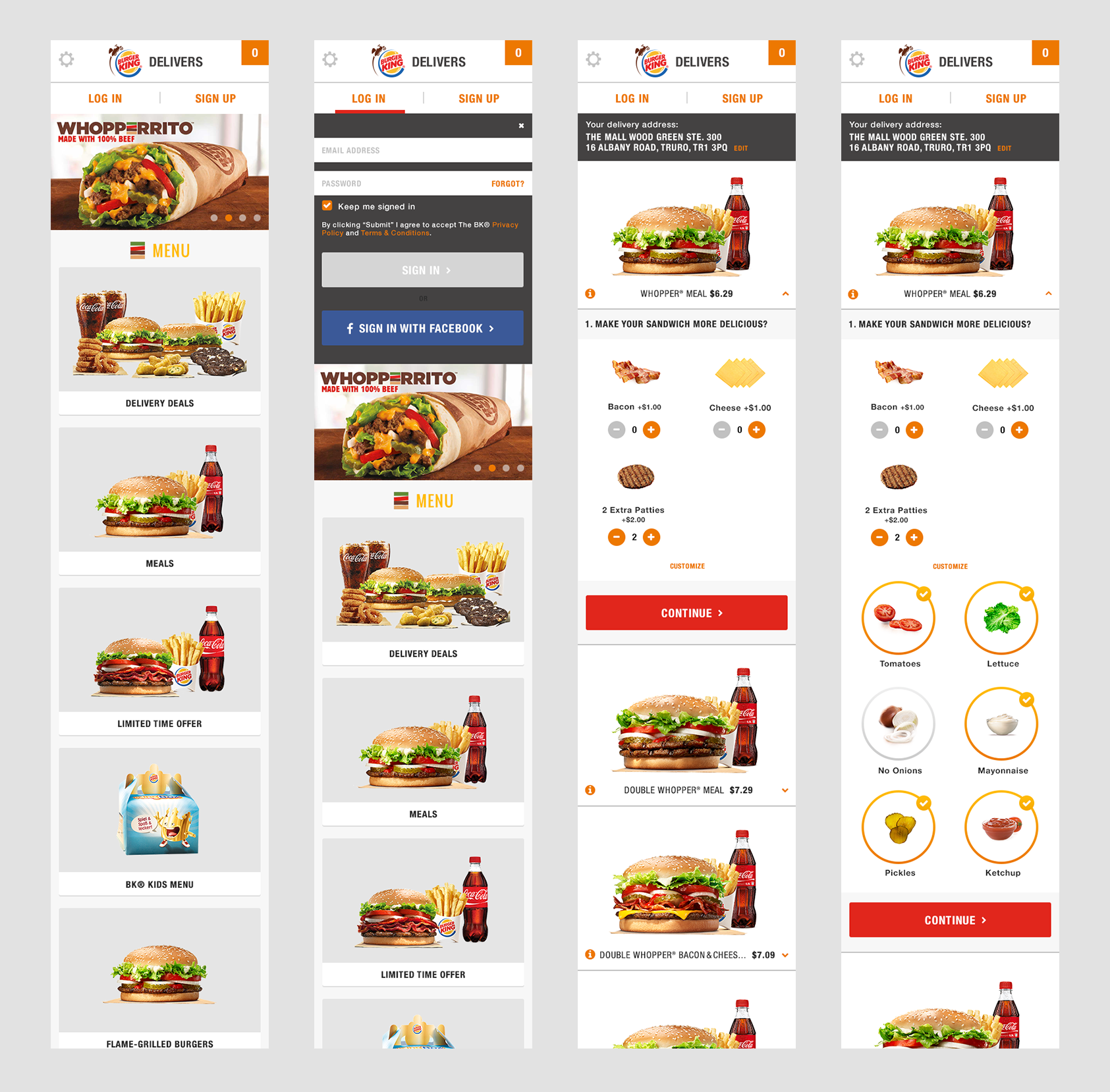
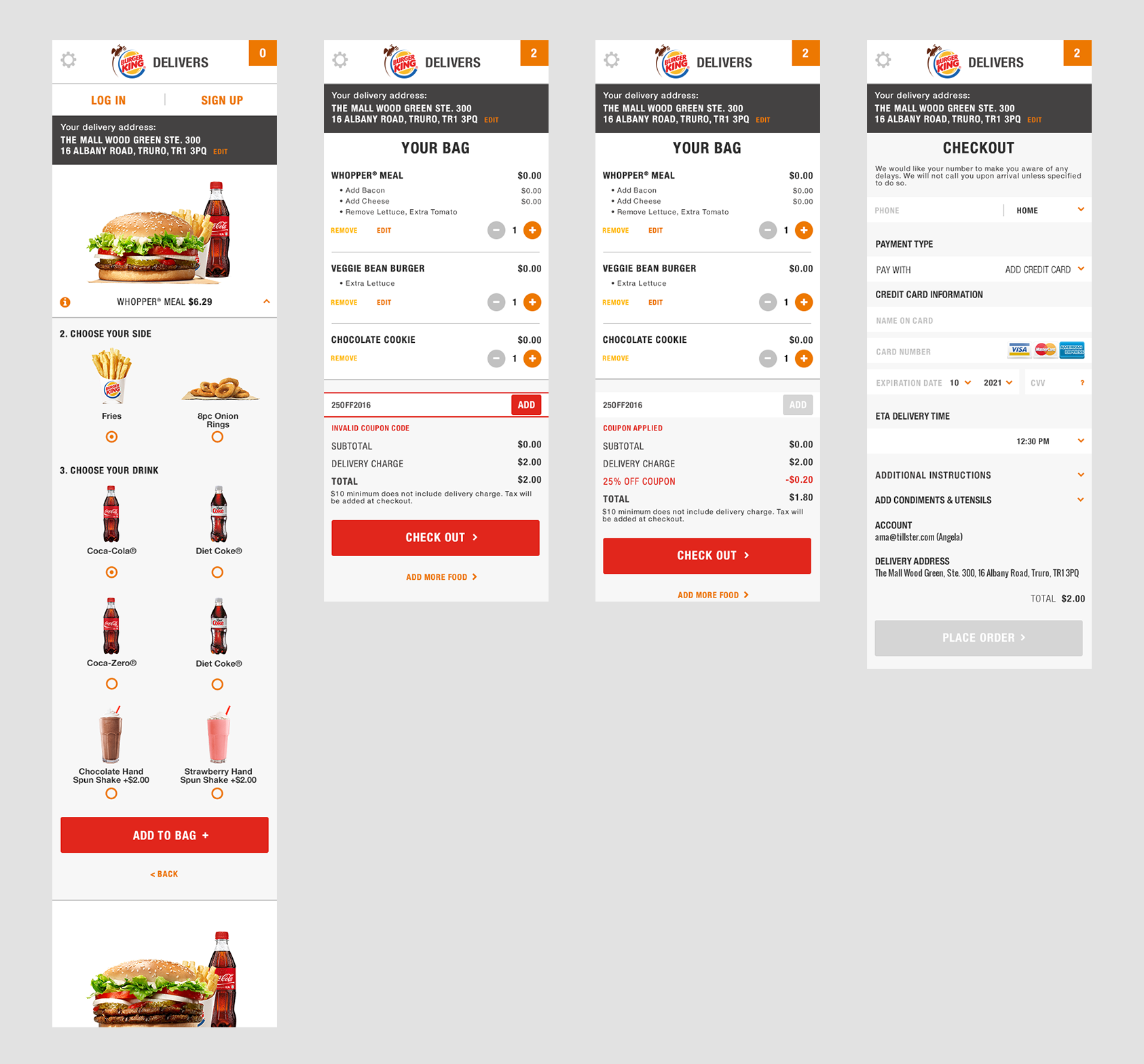
I was responsible for creating the Burger King Delivers responsive site in the mobile view. By working closely with the Art Director, Product Manager, and the developers, I made sure the look and feel were consistent with Burger King’s already established style guide. In addition, I designed a visual hierarchy to handle heavy image content on pages. I did multiple key mobile screens including Homepage, Onboarding (Log in), Burger Customization, Shopping Cart and Checkout, etc. My role in this project is UI/UX designer.
My key takeaways on this project:
- What colors are good for food apps?
When it comes to food app design, let the color of the food photography shine through while keeping UI colors limited. Having a minimalistic look with a significant amount of white space is key for signaling to users that their food will be clean and fresh.
- What is simple UX?
Creating a simple UX is one of the driving principles in food app design. Simple UX means that users can find what they want to order and check out in just a few steps. It also makes it easier for users to scan a page and grasp its visual hierarchy.
- What makes for good UX?
Good UX is intuitive and easy to use. It’s especially important to consider UX in food app design because users typically order meals when they are short on time. Food ordering apps should be intuitive, provide easy search functions, and make it convenient for users to reorder the products they want.
Final Design:


