Overview:
Chick-fil-A, a leader in the quick-service industry, was growing fast with new restaurants opening up all over the country. One of the most important channels Chick-fil-A uses to communicate with thousands of its restaurant owners is its annual conference that brings the organization together for four days. And it had been occurring for over 40 years, however, this had become impossible during the pandemic. 15 Seconds of Fame Inc was able to provide the AFA platform to help the corporate engaging with their restaurant owners virtually during this unusual time, with their AFA (Audience From Anywhere) platform.
Problem 1:
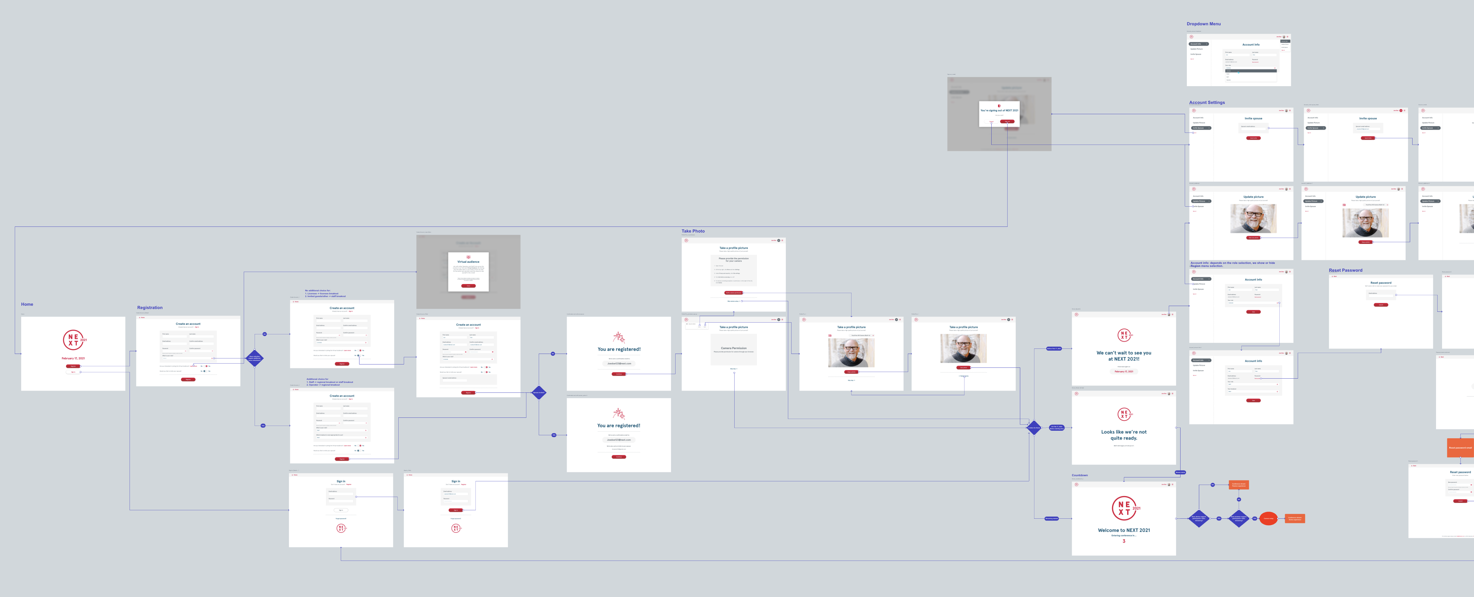
The restaurant owners are not necessarily tech-savvy. We needed to have the users register for themselves along with their spouses, get the camera set up if they want to be part of the virtual audience, receive a confirmation email, everything needed to be done within 5 mins. The client wanted to communicate to the users clearly on the landing page.
Process:
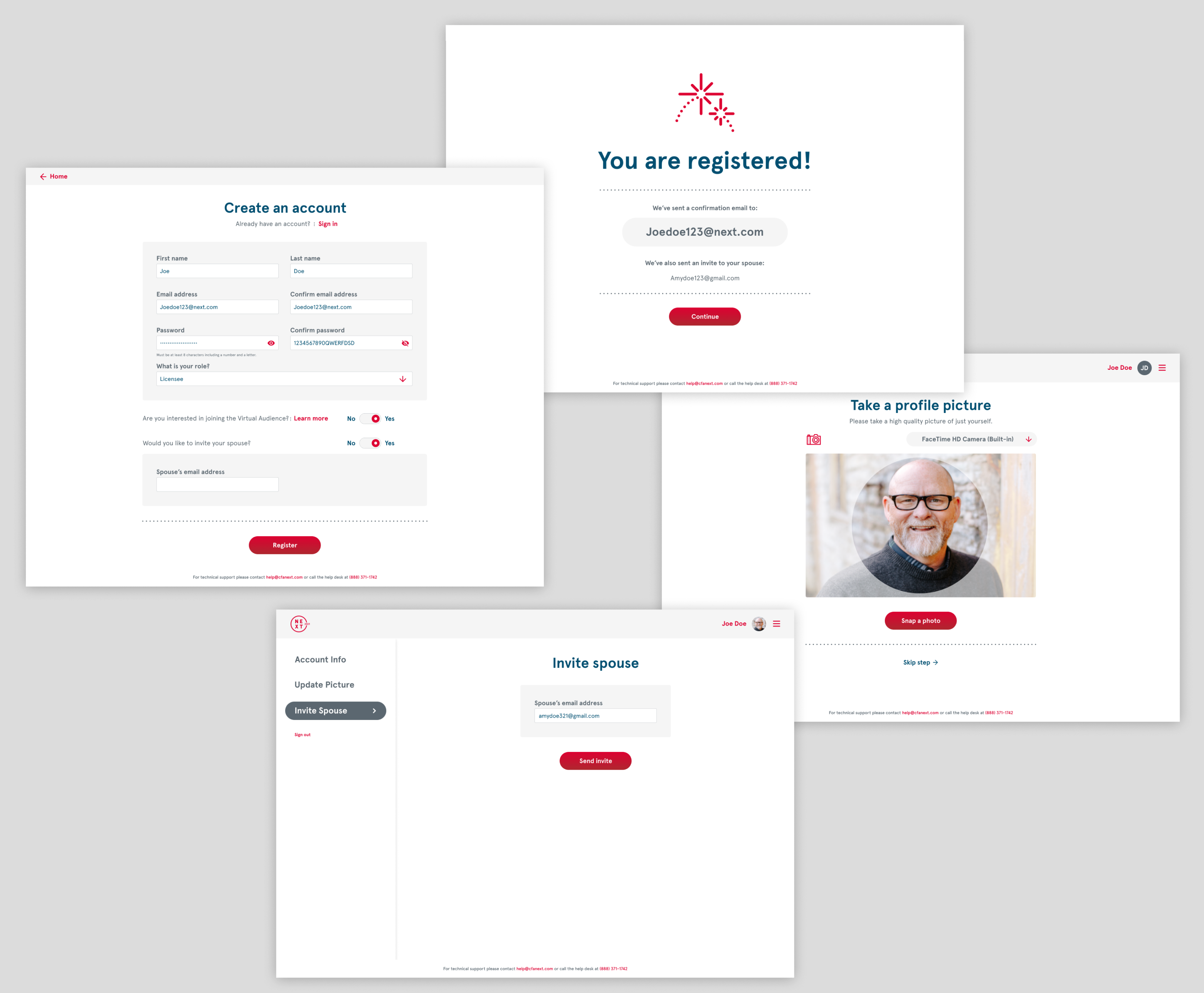
I was tasked to design the registration process from start to end, using the design language that Chick-fil-A had provided. After communicating with the client, I realized the design of their conference registration site should have a focus on minimizing necessary information, clearly deliver the message to the user the incentives of being a virtual audience on the conference live stream. Recommendations were made based on results from a couple of rounds of user tests.
See full registration flow in mobile view here.
Minimal color theme and simplistic layout to improve the usability
Problem 2:
For the Live experience, the client wanted to have a chatroom feature while the live streaming is going on. since there were 8000 attendees, if most ppl are typing and sending messages in the chatroom, the message will roll up so fast that no one could even possibly read anything.
Solution:
I suggested dividing the attendee into smaller groups since I designed the registration flow, I knew there was a way to divide them by restaurant district. The client agreed on this idea and they pushed even further: the attendee only has 2 chatroom options: the district he belongs to, and the main chatroom, so the dropdown menu won’t get too long.
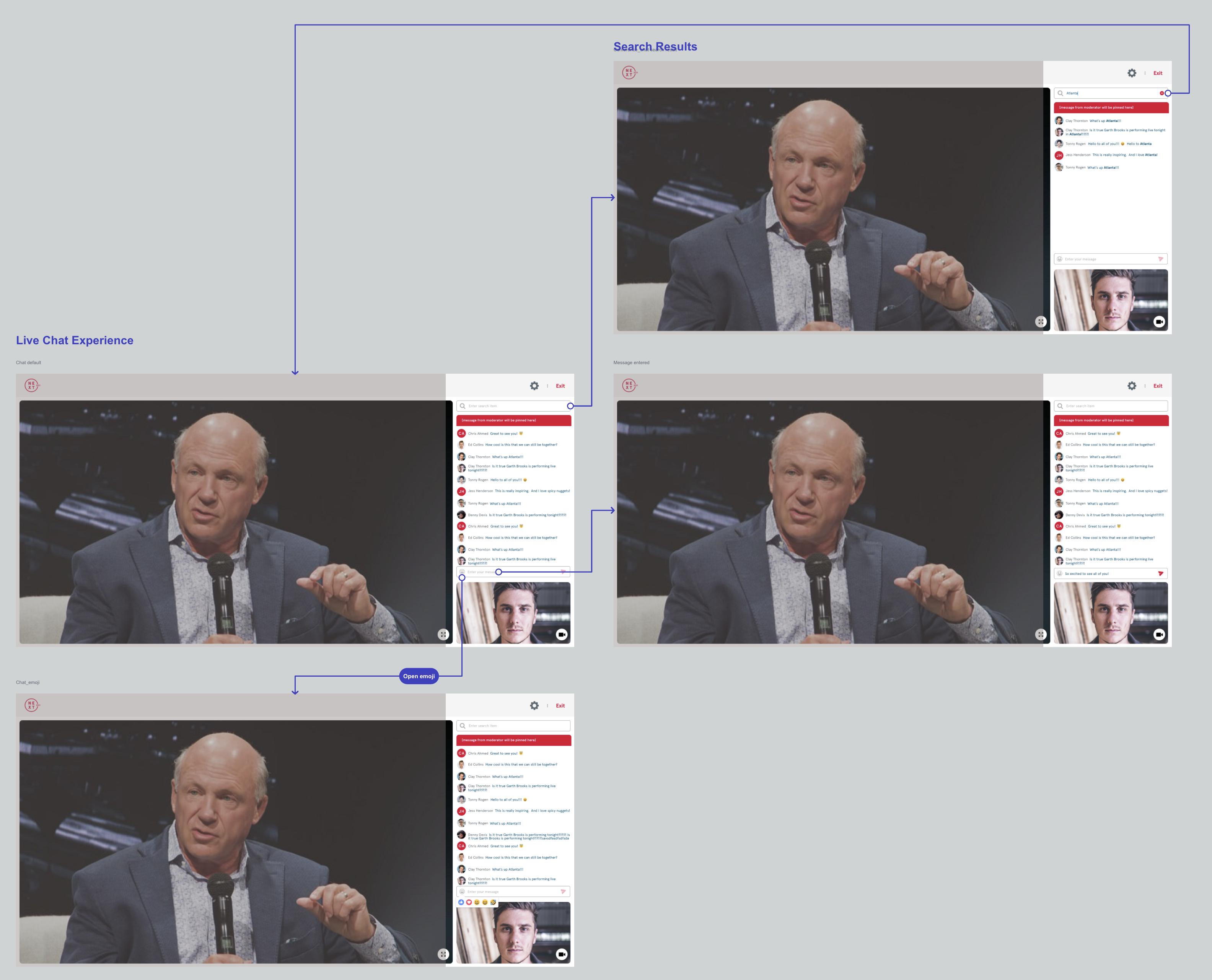
Chatroom user flow:
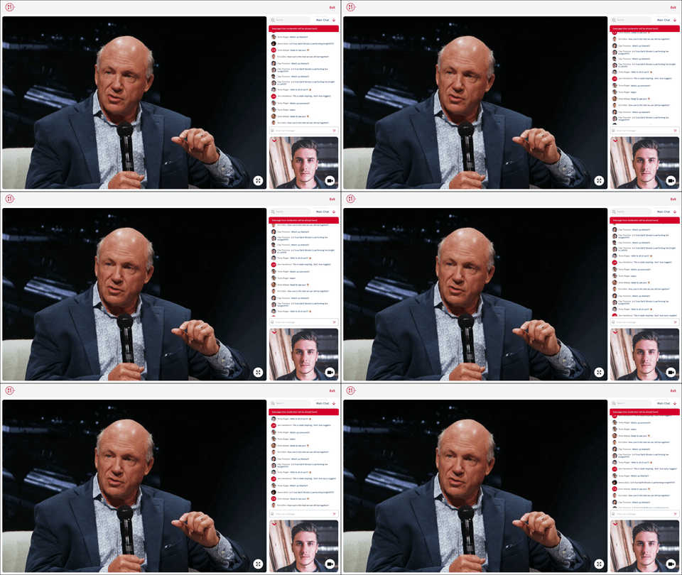
Final design on Live Broadcast:
I also added a search field so that if anyone wants to find any other attendees or anyone’s comment, he can find the information by searching for it there. I also added a red banner on top of the chat, so if there is an announcement to the whole audience, the message can be pinned there. The user can switch between the 2 chatrooms as he wishes. If he wants to see more chat content, he can collapse his own video stream.
The event debuted on Feb 17 and was highly successful. Even after the live stream ended, many attendees remained on the platform for a considerable amount of time and left overwhelmingly positive feedback in the chatroom.


