Introduction
In music education, piano teachers often find themselves in need of a consolidated platform to locate sheet music tailored to their students’ age, proficiency levels, and all other different factors. Our challenge was to design a filter system for the database that made this process not only efficient but also intuitive. The client already has a running website in place, but it looks outdated and the UX is clunky.
The Challenge
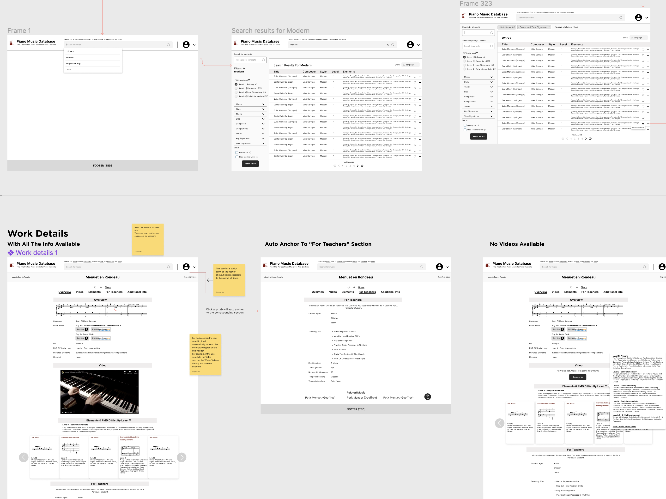
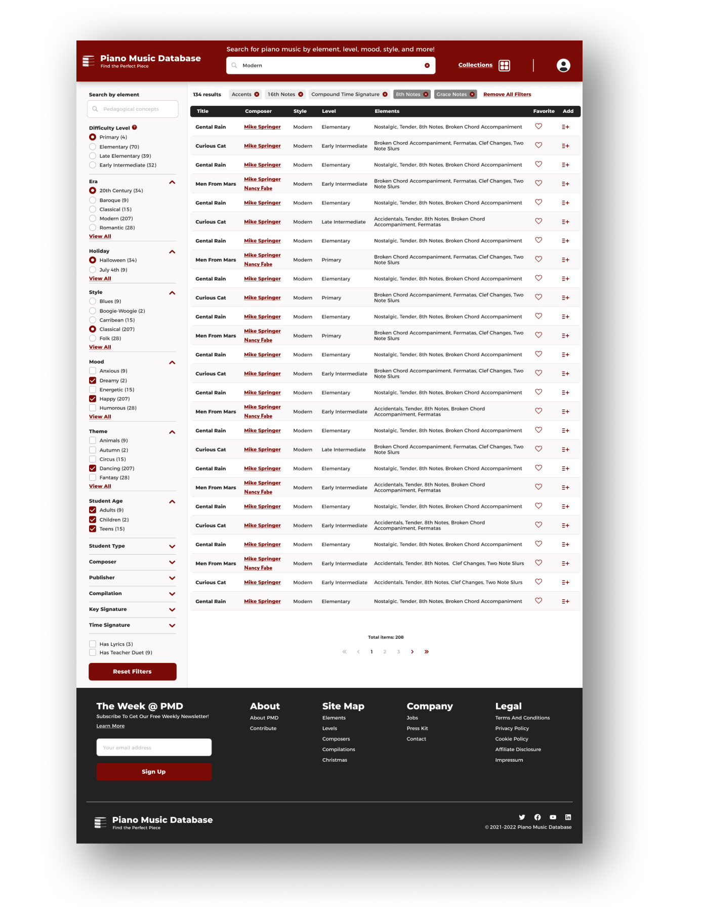
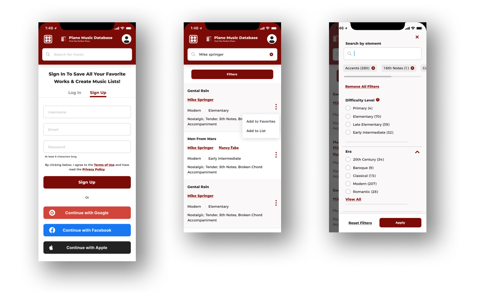
The primary challenge lay in creating a robust yet user-friendly filter system. With thousands of music pieces in the database, the design had to ensure users could quickly find what they were looking for without feeling overwhelmed.
Objective
Design a platform catering primarily to piano teachers, allowing them to:
- Effortlessly search for piano pieces based on varying skill levels.
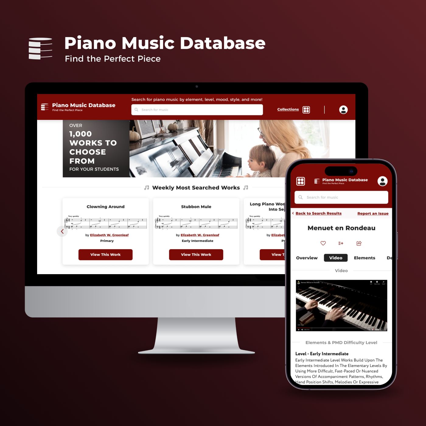
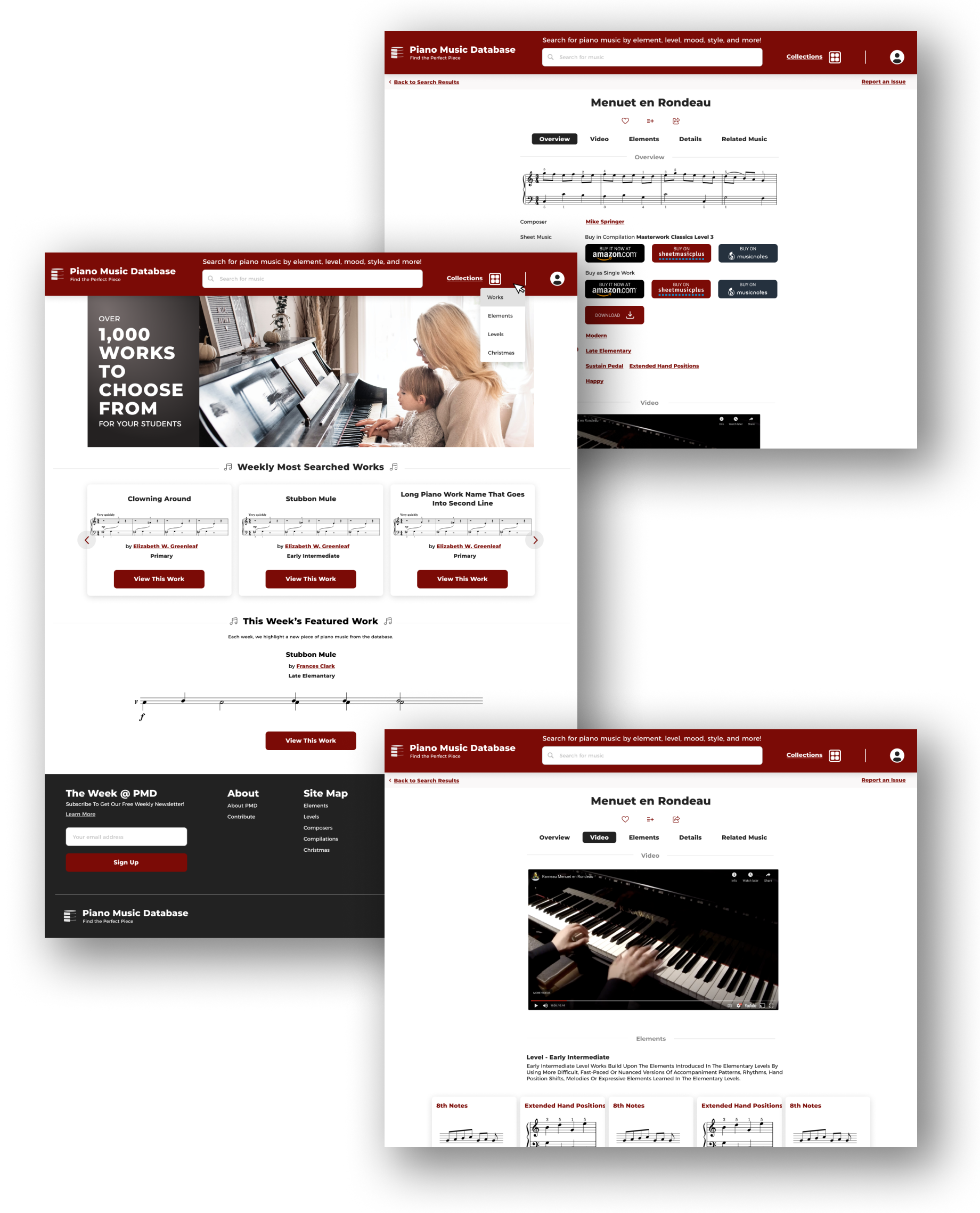
- Access detailed information about the selected piece.
- Have the option to purchase the music or view a demonstrative video on how to properly play it.
Design Process
- User Interviews: Conducting an interview with a couple of piano teachers provided invaluable insights into the needs and pain points of the target audience.
- Wireframing the Filter System: Given its complexity, special emphasis was placed on the filter system’s design, ensuring it was both efficient and maintained a clean aesthetic. Beyond the search, detailed pages for each music piece were designed to offer users more than just the sheet music, adding value through purchase links and tutorial videos.
- Hifi UI Design: We chose to retain the color palette from the old site, updated the font family, and introduced icons to enhance the site’s appeal and interest. Although the site is text-heavy, the addition of icons and the rounded corner design ensure it doesn’t appear monotonous.
Outcome
After months of design and development, we successfully launched the site. It became a go-to resource for piano teachers, making it much easier to find the right sheet music. One of the standout features was the integrated filter system, which handled a large amount of data while keeping the interface simple and easy to use.
Key Takeaways
- User-Centered Design: Listening to users during interviews helped shape the final design in a meaningful way.
- Balancing Efficiency and Aesthetics: Finding the right mix between a powerful search function and a clean design was challenging, but we pulled it off in the end.
See the live site here.